
PhysiCam Dashboard
A web-based dashboard for physiotherapists that presents physical rehabilitation clients’ therapy progress, helping the clients’ healthcare team to collaboratively monitor their progress and goals
Tags: Web, health, physiotherapy, dashboard, data visualisation
CONTEXT
Part of the thesis project at The University of Queensland, Australia, under the NeuroEngineering, Rehabilitation, and Medical Robotics (NRM) Lab.
SKILLS & ROLE(S)
Lead researcher,
Lead product designer, User research, Product discovery, Data visualisation
Sketch, Maze, Miro, Freeform
TIMELINE
10 months, Feb-Nov 2024
TOOLS
THE PROBLEM
PhysiCam is a movement-tracking software developed jointly by UQ, Griffith University, and Princess Alexandra Hospital to help physiotherapists count exercise repetitions during rehabilitation sessions. However, the software only shows the counter live during therapy and exports data as raw CSV files. Without a summary or dashboard, physiotherapists struggle to easily review progress and make informed decisions for future rehab sessions.
Our lab hypothesise that by integrating a dashboard to Physicam Software with rich data visualisations, such as graphs and diagrams, might improve the productivity and workflow of the care team.
CHALLENGE
How might we design a dashboard that effectively visualises data captured by the camera and PhysiCam software during rehabilitation sessions?

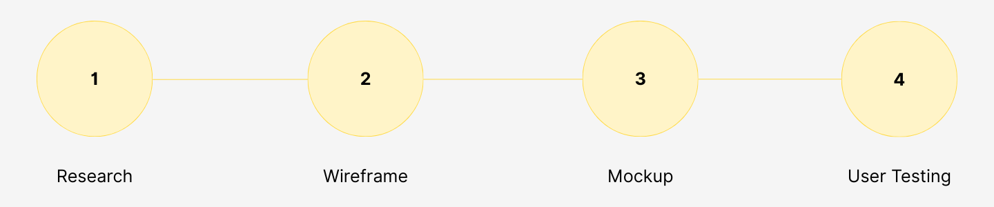
THE PROCESS
As this thesis project already has a defined set of requirements provided by the supervisor, my primary task centres on translating these needs into an effective design. The design processes that this project went through are:
1 - RESEARCH / CONTEXTUAL INQUIRY
Requirements from stakeholder
Showing progress history and trend
Enable the physiotherapists to view their client’s progress from the start and compare performance between sessions
Providing way to give notes or annotation to client’s progress
Annotate on the data points to mark significant event during the session for future references and for colleagues
Displaying the data with visual graphics
Adds visual elements into the dashboard, such as data visualisations, so it will be easier to understand the clients data
Providing a helicopter-view for the management
Enable team leader or hospital manager to review the progress of all patients and their team’s workload
Observations
To complement the insights I gathered from my supervisor as the main stakeholder, I did observation and asked some questions to the physiotherapists about how the current PhysiCam software is being used during their practice and their opinions about the experience.
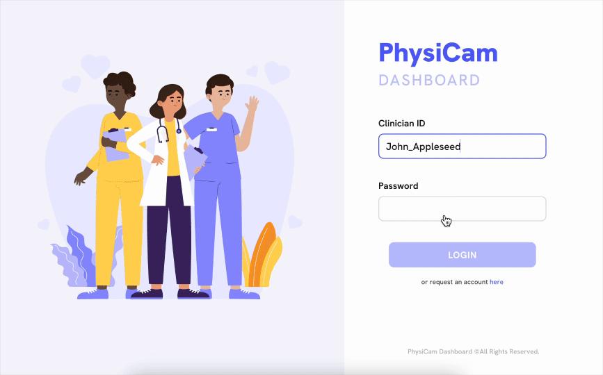
They usually run the software on a laptop and place it on a trolley table. This way, they can easily move it from one exercise location to another and adjust the webcam for a better view. There is no significant issue in the camera tracking process.
This approach helped me to understand how the physiotherapists interact with the software (and later the dashboard) and what kind of information that they might need to improve their productivity.
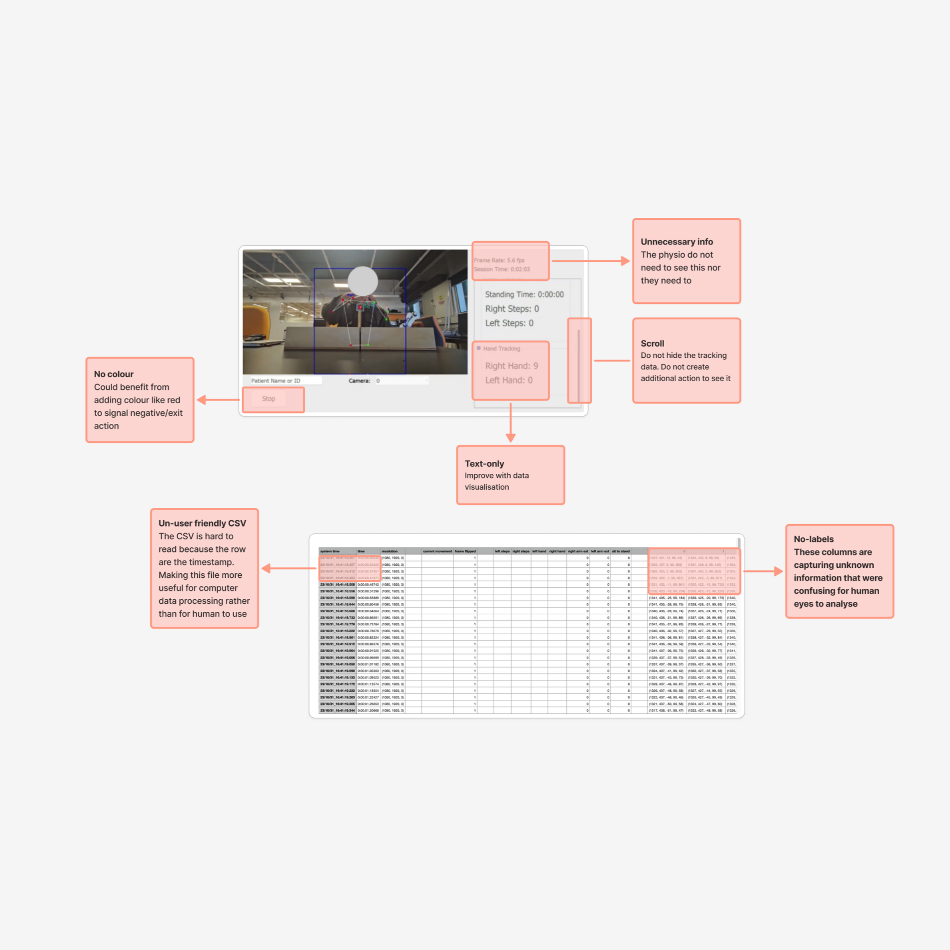
Audit of the existing software
This evaluation’s goal was to compare the existing interface design against the stakeholder and user needs, as well as design theories. By dissecting and auditing the software’s UI/UX design, I aimed to highlight pain points and potential solutions to add into the dashboard.
KEY FINDINGS:
Poor hierarchy - meaning user has to look extra carefully for information, including scrolling several times
Old-style windows interface - out of date, not giving excitement to keep using
No colour combinations - making the interface look boring and hard to differentiate clickable vs non-clickable elements
No data visualisations - only text-based data in the screen that later exported into CSV
No trends, summary, or notes - making it difficult to make use of the data for future therapy adjustments
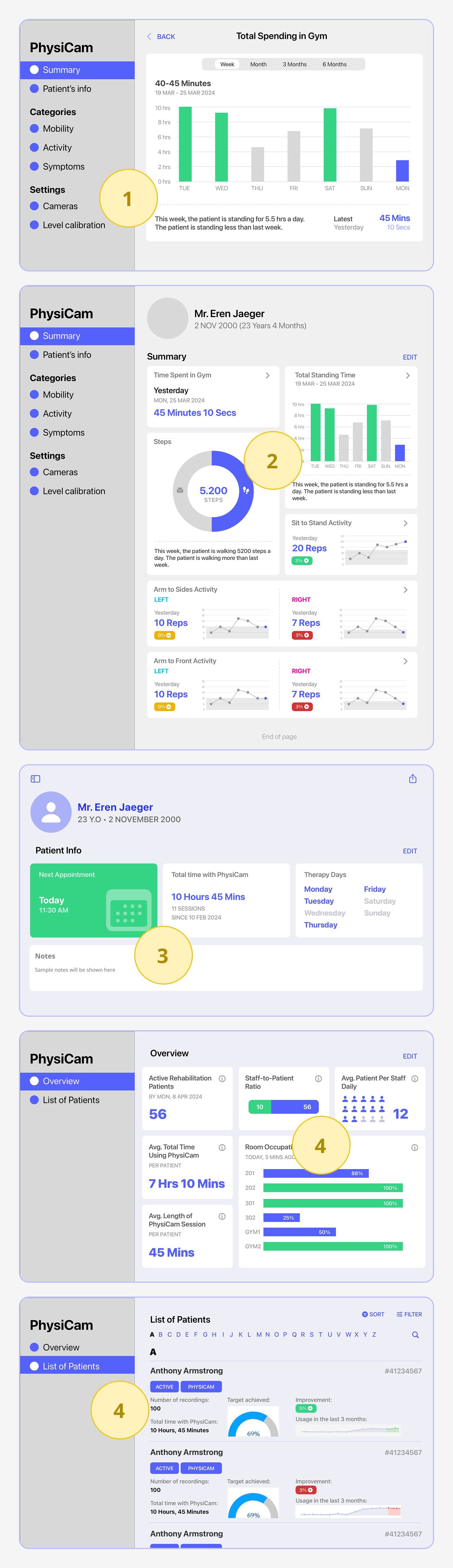
OPPORTUNITY 1
Modular card
Each of tracked data point designed as a card to group elements of that data point together
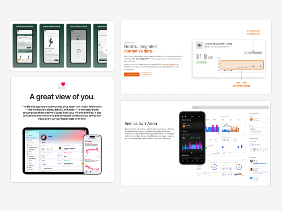
Competitor Analysis
Competitor analysis reveals how similar health apps design their dashboards. They have lots of data but keep the design simple and neat.
They utilise colours to highlight certain information and differentiate one from another, making it pleasant to navigate the data.
Credit: (Top) Physitrack app, VALD performance, (Bottom) Apple Health, and Garmin Connect.
OPPORTUNITY 2
Summarising Progress
Provide contextual information relevant to the progress shown in the diagram above it
OPPORTUNITY 3
Colour Coding
Provide additional information towards the data, such as green for improvements and red for otherwise
2 & 3 - DESIGN: WIREFRAME & MOCKUP
Wireframes Ideation
SOLUTION 1
Allow users to track clients’ progress with summary and trends of each data point
Each of tracked data point designed as a card to group elements of that data point together
SOLUTION 2
Adds data visualisations and progress summary
Provide contextual information relevant to the progress shown in the diagram above it
SOLUTION 3
Allows users to leave notes on their session/shift
Provide important context with notes may help them remember things for future references and help their colleagues pick up from where they left it
SOLUTION 4
Provides information about staff allocations & work load
Helps team leader or hospital management know how many active patients are on-going treatment and staff allocations
Interactions Overview
Simple Design System
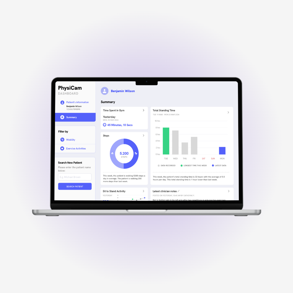
Mockup Prototype
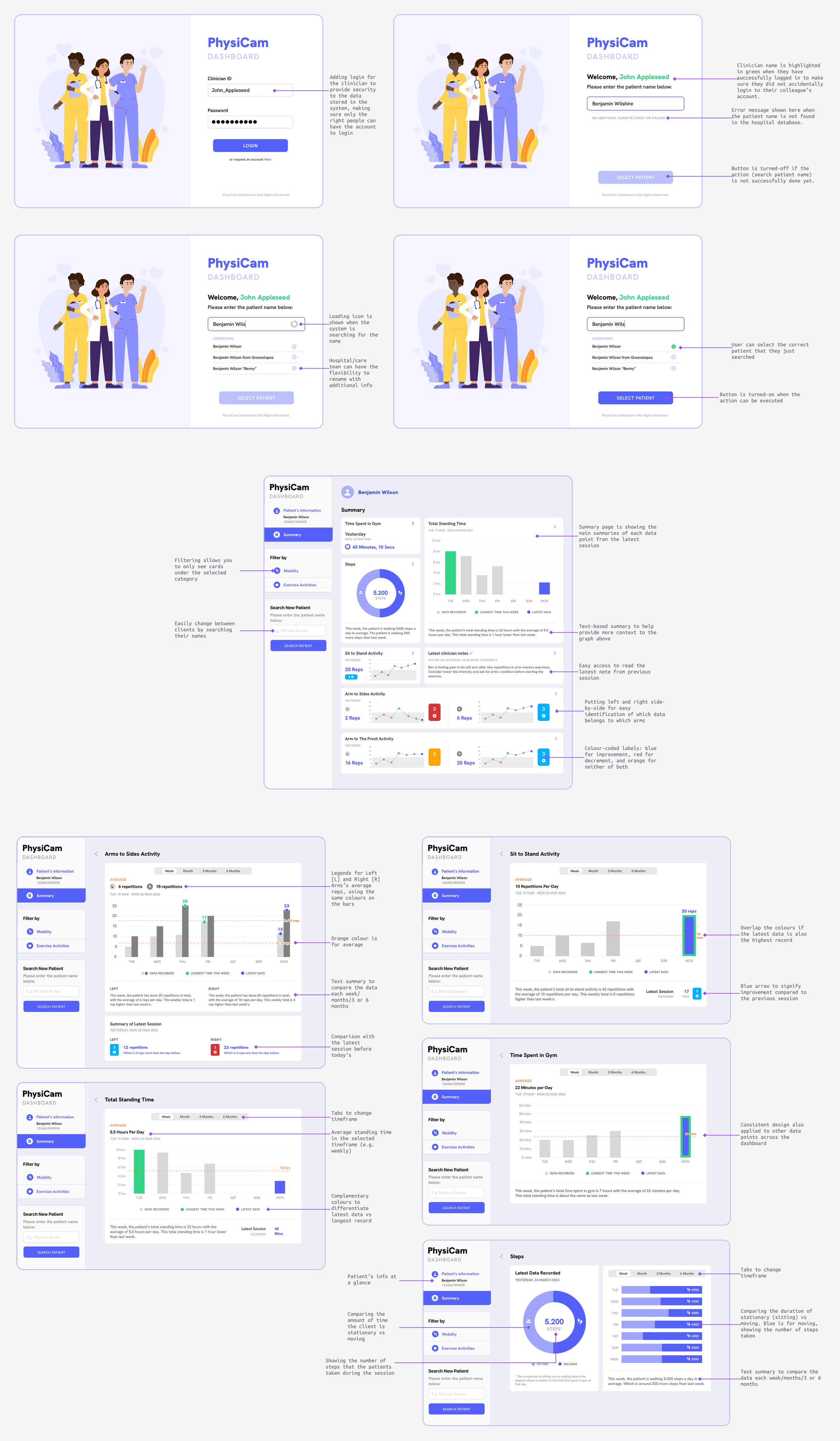
After the wireframes went through two rounds of feedback sessions from the stakeholder, I designed the high-fidelity prototype to preview how the final design might look like.
At this stage, I have already using the final measurements, colour palette, and other visual information.
The charts and diagrams that were chosen for each data point is using the appropriate form for their type of information.
The interaction overview of the project
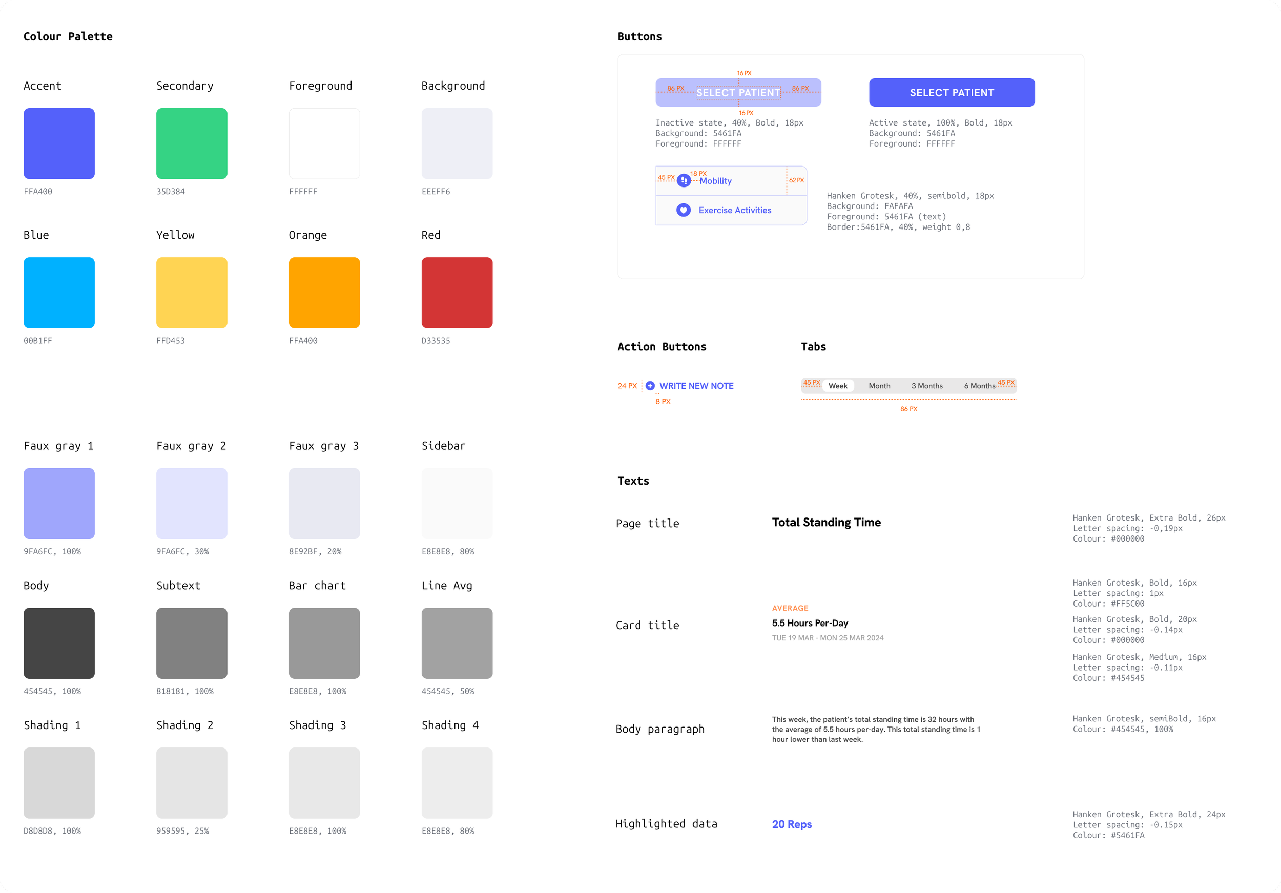
Simple design system of this dashboard
4 - USER TESTING
This project was using three different user testing methods to capture insights from different areas: usability testing and the System Usability Scale (SUS) questionnaire with eight allied healthcare professionals (including physiotherapists), and heuristic evaluation with one design expert.
Quantitative Research Results
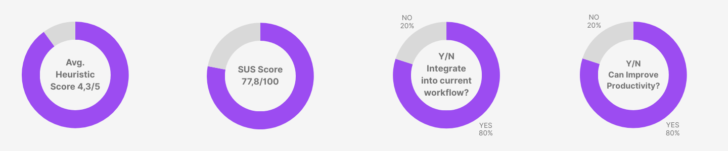
The quantitative result from SUS and usability testing shows positive results in favour of the design
Qualitative Research Results
I analysed the qualitative feedback using thematic analysis, which is grouping similar feedback together and see if there was any common theme.
Using affinity diagram, I can see which area/theme that most talked about, implying that users have significant focus in that area.
I presented the main themes in the treemap visualisation where each size of the block is representing the number of feedback/comments.

Combined Results Summaries
POINT 1
Good Usability with Minor Issues
The combined scores from the quantitative tests results is in the range of upper 70 to upper 80 which is described as good (Bangor et al., 2008)
POINT 2
Key Design Strengths
Effective data visualisation combines clarity and helpful summaries, consistent visual style and colour palette, and the use of multiple methods to represent the data
POINT 3
Key Areas of Improvements
The main page (Patient Summary) needs simplification to help users focus more effectively on key information, and greater clarity is required in some data visualizations, such as adding axes labels

Leadership
I led the entire research and design process, from ideation to prototyping. I collaborated with my supervisor, Dr. Alejandro Melendez-Calderon from the University of Queensland, and allied healthcare professionals in Brisbane, Australia, to gather their unique perspectives on the problem space as end-users. My role in this project is not only solving problems and translating their wants/needs, but also advocating for the user experience and best design practices.
Takeaways
Data visualisations help reduce cognitive load when reading and understanding the data.
The physiotherapists and allied healthcare professionals loved the design and can understand the intentions behind every visualisation. They agreed that the summaries and the graphs helped them understand what’s going on with their clients, thus preparing them to plan ahead of their next sessions.
Next Step
The PhysiCam project is being continued by UQ NRM Lab in Brisbane, Australia. I have agreed to be consulted if the researcher continuing the project has any questions regarding the design.